Hero layouts
Start with a heading, supporting text, two calls to action, and an image. This first example focuses on the layout; the image frame, section background, and final button styling can be added next.
Text left, image right
flex-md enables a row from 820 pixels, and flex-1 lets the two columns share the available space. items-center centers the text vertically beside the image. Below medium the content stacks in reading order. The two calls to action are ordinary links with simple utility styling, without a dropdown or extra JavaScript.
Develop
Build your next project with readable utilities and flexible layouts in Epic CSS.
<section class="flex-md items-center gap-40" aria-labelledby="split-hero-title">
  <div class="flex-1">
    <h1 id="split-hero-title" class="fs-50 lh-normal mt-0 mb-24">Develop</h1>
    <p class="mb-32">Build your next project with readable utilities and flexible layouts in Epic CSS.</p>
    <div class="flex flex-wrap gap-16">
      <a class="py-12 px-24 clr-primary-bg border-r-4" href="/docs/installation/">Get started</a>
      <a class="py-12 px-24 clr-primary-bg border-r-4" href="/docs/">Documentation</a>
    </div>
  </div>
  <div class="flex-1">
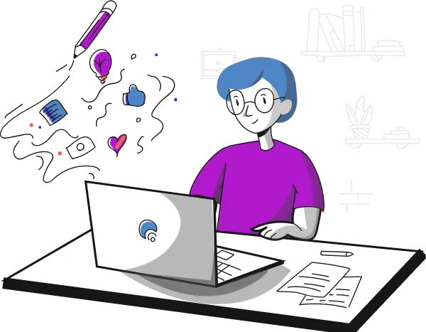
    <img class="w-100" src="/assets/home-banner.webp" alt="Illustration of a developer working on a laptop" width="600" height="467">
  </div>
</section>
The local illustration is a replaceable image. Use your own photo and update its alternative text and dimensions when adapting the hero. The hero contains the page's h1; use an appropriate heading level if you place it within an existing page.